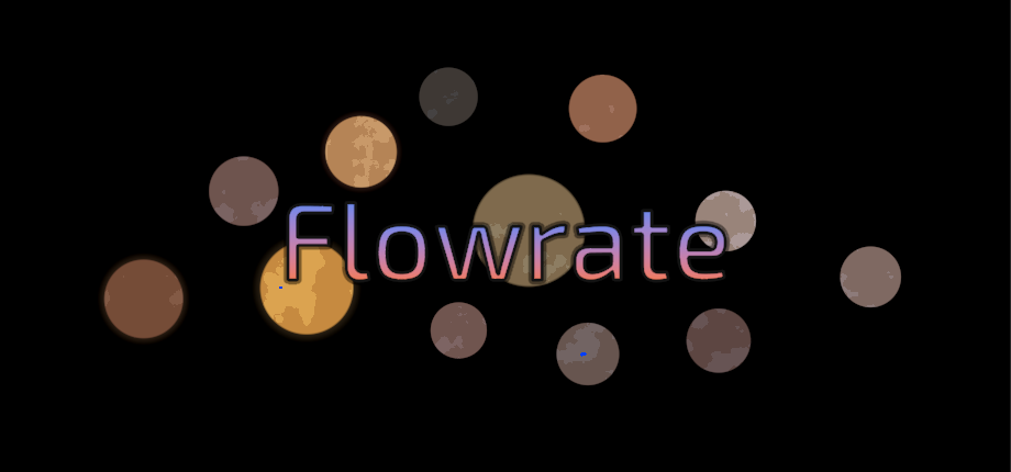
Flowrate
The Flowrate Visual Update(s) – Color, Contrast, and Cosmic Clarity
Flowrate’s planets were never meant to look realistic. They’re meant to feel alive.
This month, we’ve done a visual pass across nearly every aspect of the galaxy—from atmosphere gradients to landing site markers—to make everything more readable, colorful, and reactive without breaking the minimalist style.
Before and after: less noise, more depth
Previously, some planets had muddy shading or unclear fuel markers. Now, we’ve updated:
-
Cloud layering for more dynamic atmospheres
-
Landing site highlights that pop better against the terrain
-
Atmosphere tinting that reflects each planet’s oxygen and pressure stats
-
Starscapes that are easier to differentiate when traveling
It’s still procedural. It’s still lightweight. But now it looks intentionally beautiful.
What we’re testing next
Some experimental features are in the works:
-
Aurora effects on high-atmosphere planets
-
Surface shimmer based on temperature
-
Burn marks at frequent landing spots
None of these are final, but they’re part of a bigger goal: make each planet more distinct, even if the mechanics stay clean.
Flowrate won’t ever be a high-fidelity game. That’s not the point.
But a stark, vibrant galaxy with tiny flickers of detail? That’s the aesthetic we’re aiming for.
Get Flowrate
Flowrate
| Status | In development |
| Author | Arekcuta |
| Genre | Survival |
| Tags | 2D, physic, Procedural Generation, Space, Unity |
| Languages | English |
More posts
- Two Septillion Stars in the Sky, Not nearly so many in FlowrateJul 28, 2025
- Flowrate is Coming to Steam!May 19, 2025
- Designing Smart Decisions: What Makes Flowrate Feel StrategicApr 20, 2025
- Permanent Megastructures: Making Every Run MatterApr 16, 2025
- Megastructures, Roguelite Focus, and Visual PassApr 10, 2025
- How Fuel Usage Works in Flowrate (And Why It's Dangerous)Apr 09, 2025
- You Don’t Know What’s on a Planet Until You Get CloseApr 06, 2025
- Making Risk Feel Real in FlowrateApr 04, 2025
Leave a comment
Log in with itch.io to leave a comment.